Most leaders do not suffer from a lack of numbers.
They suffer from too many numbers, too many reports, too much delay, and not enough clarity.
By the time the monthly report lands, the problem has often already grown teeth.
That is why a good financial dashboard matters.
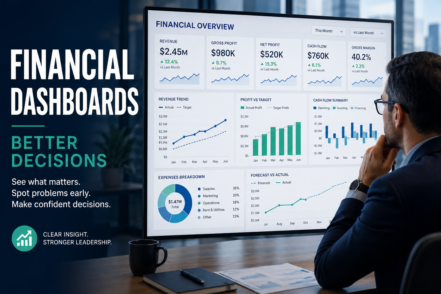
financial dashboard brings your most important numbers into one clear view, so you can see what is happening, spot what is changing, and act with more confidence. The best dashboards do not try to show everything. They show what matters most for decisions.
In my experience, this is where many dashboards go wrong. They become a colourful museum of metrics. They look impressive. They also leave the reader wondering what, exactly, they are meant to do next.
A good dashboard should make action clearer, not just reporting prettier.
Modern dashboards can pull data together from finance, sales, operations, and other systems, update more quickly than old manual reporting, and help leaders catch problems earlier. That is useful. But the real value is not the software. It is the sharper judgement that the dashboard makes possible.
This approach is part of the KrisLai Decision Framework, a practical method for improving business decisions. Better decisions come from understanding behaviour, signals, environment, and consequences. A financial dashboard should help you see those signals more clearly.
A financial dashboard should not be a wall of numbers. It should be a decision tool. If it does not help you spot risk, track performance, and act faster, it is not doing its job.
This article may contain affiliate links. If you buy through them, I may earn a commission at no extra cost to you. I only include affiliate links where they are genuinely relevant.
What a financial dashboard should show at a glance
A good dashboard should answer the obvious leadership questions quickly:
Are we growing?
Are we profitable?
Are we running short on cash?
Are costs drifting?
Are we ahead, behind, or fooling ourselves?
That means the dashboard has to stay focused.
One of the clearest lessons from current dashboard guidance is that strong dashboards do not try to show every possible metric. They prioritise the few that matter most for action. That is a useful lesson, because too many dashboards become cluttered and slow to read. A good example of this can be seen in Qlik’s financial dashboard examples, which focus on clarity, trends, and fast understanding.
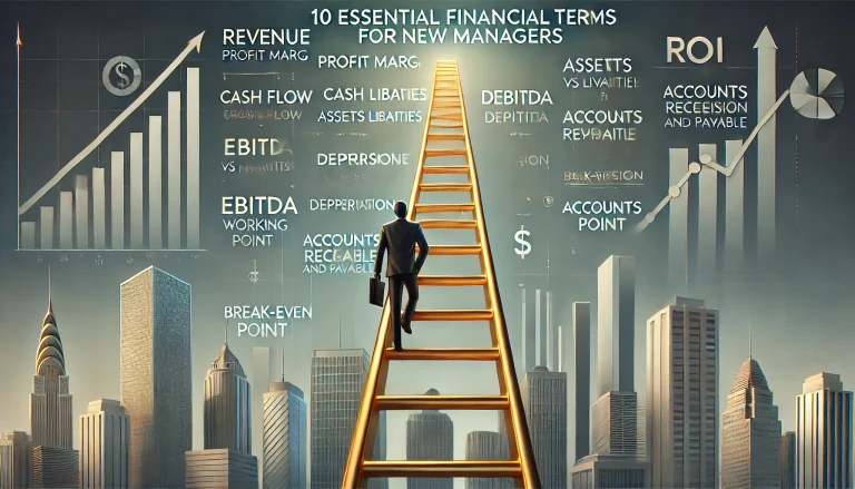
The core KPIs every leader needs to see
The exact mix depends on the business, but most leaders need a clear view of these:
Revenue
This tells you whether sales are rising, flat, or slipping.
Profit
Revenue can look healthy while profit quietly weakens. That is why revenue alone is not enough.
Cash flow
This tells you whether money is actually moving through the business in a healthy way. A business can look profitable and still come under pressure if cash timing is poor. This connects closely with cash flow forecasting, which becomes much more useful when your dashboard shows early movement instead of late surprises.
Expenses
Rising costs can quietly erode performance long before they look dramatic in a year-end summary.
Gross margin
This helps you see whether what you sell is still producing enough value after direct costs.
Growth trend
A single number means less than the pattern behind it. Trend matters.
Forecast versus actual
This is where dashboards become especially useful. It shows whether reality is following the plan or drifting away from it.
Working capital signals
Debtor days, creditor days, and cash conversion can tell you whether the business is becoming tighter, slower, or more exposed. You may find my working capital article useful in this regard.
What I have seen is that many leaders track revenue first because it is visible and emotionally satisfying. Revenue feels like movement. But movement is not the same as health. If margin, cash, or cost discipline are slipping, a pleasing revenue graph can become a very expensive comfort blanket.
How to turn raw data into a simple story
A dashboard should tell a simple story in seconds.
What is improving?
What is slipping?
What needs attention now?
That is where trend lines, comparisons, and plain labels matter. A good chart helps you read the direction quickly. A bad one makes you work too hard.
In my experience, the dashboard should pass a very simple test. If a busy leader opens it for thirty seconds, can they tell what is going well, what is not, and where a decision may be needed?
If not, it is too cluttered or too vague.
- Show the few metrics that matter most
- Highlight change, not just totals
- Compare actual results with targets or forecasts
- Make risk and drift easy to spot
- Use plain labels instead of clever-looking confusion
How dashboards improve decision-making in real time
The real advantage of a dashboard is not that it looks modern.
It is that it shortens the distance between what is happening and what you can do about it.
That matters because many decisions are worse when they arrive late.
Spot problems before they become expensive
If sales are weakening, costs are rising, or cash is tightening, you want to know while there is still room to act.
A good dashboard helps leaders notice early movement:
- falling sales in one segment
- shrinking margin on a product line
- slower collections
- higher operating costs
- forecast drift
- stock building up too far
- cash falling faster than planned
This is one reason financial dashboards are so useful. Strong dashboard guidance from The Access Group stresses the value of more current information, alerts, and visibility across multiple systems. The older CFO-focused dashboard material in the Limelight ebook also emphasises real-time insight and drill-downs.
That matters because small problems are often much cheaper to fix than mature ones.
A dashboard does not remove uncertainty. It gives you a better chance of seeing it earlier.
Use trends and forecasts to plan ahead
A dashboard should not only explain the past.
It should help you prepare for what comes next.
That means comparing actual figures with targets, checking whether the forecast still makes sense, and spotting where assumptions may now be wrong.
This is where better leadership thinking comes in. Decisions under uncertainty are rarely about certainty. They are about seeing enough of the pattern to act sensibly before the picture is perfect.
What I have seen in practice is that leaders often wait too long because the monthly report feels official while the dashboard feels provisional. That is the wrong way round. A good dashboard is where you notice movement early. The formal report confirms what is already becoming visible.
My article on 5 financial ratios every business leader should understand explains further why trend and comparison often matter more than the number on its own.
The dashboard features that make the biggest difference
Real-time updates and data from multiple systems
One reason dashboards have become more valuable is that they can pull together information from finance, sales, operations, and other sources into one view. The Access Group’s guidance makes that point clearly, and it is one of the most useful parts of a modern dashboard.
This matters because leaders do not make decisions inside neat departmental boxes.
Finance affects operations.
Sales affects cash.
Hiring affects cost.
Pricing affects margin.
Delivery performance affects revenue quality.
A dashboard that only shows finance in isolation can still be useful, but a dashboard that connects finance with the wider business gives a fuller picture.
Filters, drill-downs, and custom views
One of the good points in current dashboard guidance is the value of drill-downs and role-based views. A leader may want the top-level picture first, then the detail behind the movement. The Access Group and the Limelight CFO dashboard ebook both point in this direction.
For example:
- the owner may want a single business-wide view
- the finance lead may want more variance detail
- the operations lead may care about cost and throughput
- the sales lead may need revenue and margin by segment
This does not mean building five different dashboard monsters. It means designing the same dashboard so different people can find the level of detail they need.
Clear visuals that reduce confusion
Not every chart deserves to live!
A dashboard should use visuals that help people understand fast:
- line charts for trends
- bars for comparison
- clear targets or thresholds
- simple colour use
- plain language labels
In my experience, if a dashboard starts to look like an art exhibition sponsored by three consulting firms and a packet of highlighters, it has probably lost its way.
The same lesson shows up in practical dashboard-building resources such as Career Principles’ dashboard guide, where simplicity and ease of reading matter more than clever layout.
How to build a dashboard leaders will actually use
Start with the decisions leaders need to make
This is the biggest gap in many dashboard articles online and, in my view, the most important one.
Do not start with the software.
Do not start with the data dump.
Do not start by asking which charts look nice.
Start with the decisions.
What decisions do leaders need help with?
Should we hire now or wait?
Can we afford this investment?
Is pricing still working?
Do we need to cut costs?
Is cash pressure building?
Which part of the business needs attention first?
If the dashboard is not built around real questions like these, it may still be informative, but it will not be especially useful.
This connects closely to how I think about decisions more broadly in the KrisLai Decision Framework™. Better decisions come from understanding behaviour, signals, environment, and consequences. A dashboard should help you read the signals that shape the decision, not just admire the data after the fact.
A good dashboard starts with the decisions leaders need to make. The metrics come after that, not before. This is one reason so many dashboards fail: they are designed around available data rather than useful judgement.
Keep the layout focused and avoid clutter
One strong theme across current dashboard guidance is simplicity. Whether the page is vendor-led, example-led, or tutorial-led, the best advice is still to keep the dashboard focused. Qlik’s examples are useful here because they show how much easier a dashboard becomes when it is selective.
That usually means:
- group related numbers together
- limit the number of charts
- put the most important metrics first
- show trends, not just snapshots
- remove anything that nobody uses
What I have seen is that dashboards often become bloated because each department wants “just one more metric”. After a while, you are no longer looking at a dashboard. You are looking at a hostage situation involving fifteen charts and no clear answer.
Check data quality and ownership
Leaders only trust dashboards when the numbers are reliable.
If the data is late, inconsistent, or disputed, the dashboard becomes a very polished way to spread doubt.
This is another strong point in current dashboard guidance: data quality, integration, and ownership matter as much as design. The Access Group covers this well.
Someone should be responsible for:
- where the data comes from
- how often it updates
- who checks it
- what happens when it is wrong
- which definitions are being used
Trust is not a decorative extra. It is the whole point.
What this looks like in real business
Let’s make it practical.
A small service business might track:
- revenue
- gross margin
- debtor days
- cash in bank
- utilisation
- forecast versus actual
That gives the owner a quick view of whether the business is busy, profitable, and getting paid on time.
A retail business might track:
- sales
- gross margin
- inventory turnover
- returns
- cash flow
- weekly trend versus target
That helps the leader see whether stock is moving, whether margin is holding, and whether weak performance is starting to spread.
A growing company might track:
- monthly recurring revenue
- burn rate
- runway
- cash flow
- customer acquisition cost
- forecast versus actual
That helps leadership decide whether to hire, spend, raise money, or slow down.
A useful dashboard is not the same in every business. The right dashboard reflects the decisions, pressures, and risks of that business model. What matters in retail is not exactly what matters in services or a growth-stage firm. The principle stays the same: show the signals that support better decisions.

Where this goes wrong
This is worth saying plainly.
Many dashboards fail.
Not because dashboards are a bad idea, but because they are often built in the wrong way.
Common problems include:
- tracking too many numbers
- using old or unreliable data
- showing only lagging metrics
- copying someone else’s dashboard
- building for presentation instead of decision-making
- making the layout too busy
- failing to explain what needs action
In my experience, one of the most common mistakes is measuring what is easy rather than what is useful.
It is easy to fill a dashboard with familiar numbers.
It is harder to choose the few that genuinely improve judgement.
- The dashboard shows everything and clarifies nothing
- It reports the past but does not support the next decision
- The data is trusted by nobody and questioned by everyone
- It looks impressive in meetings but is ignored the rest of the month
- It tracks metrics because they exist, not because they matter
What you should actually do
If you want a dashboard leaders will actually use, I would start here:
First, list the three to five decisions your leadership team makes most often.
Second, identify which metrics genuinely support those decisions.
Third, cut anything that does not help.
Fourth, include at least one early-warning signal, not just summary results.
Fifth, make the dashboard easy enough to read in under a minute.
Sixth, check whether the data is trusted.
Seventh, review the dashboard regularly and remove what nobody uses.
That may sound less glamorous than “build a revolutionary dashboard ecosystem”, but in my experience it works far better.
Dashboards are useful when they reduce guesswork, not when they increase decoration.
Conclusion and Final Thoughts
A financial dashboard should help leaders move from guesswork to clearer action.
A financial dashboard should not just help you report the past. It should help you see what matters, spot problems early, and make better decisions with more confidence. If your dashboard adds noise instead of clarity, it is time to simplify it and rebuild it around the decisions that matter most.
The best ones do not overwhelm you with data. They show what matters, what is changing, and what needs attention. They help you spot problems earlier, compare results with expectations, and plan with more confidence.
What I have seen is that a good dashboard does not just improve reporting. It improves thinking.
That is why this topic matters. Better decisions come from understanding behaviour, signals, environment, and consequences. A financial dashboard, built properly, helps leaders see those signals sooner and respond more wisely.
If your current dashboard feels cluttered, slow, or forgettable, that is the place to start.
Ask yourself:
Does this dashboard help me make better decisions, or does it simply give me more numbers to stare at?
If you want to strengthen your financial decision-making further, review your dashboard alongside my articles on cash flow projections, working capital, and financial ratios. Those topics belong together. When the numbers connect, the decisions usually get better too.
Review your current dashboard and ask one simple question: does it help you make better decisions, or does it just give you more numbers to stare at? Start by cutting the clutter, keeping the KPIs that matter most, and linking your dashboard to the real decisions your business needs to make.

Frequently Asked Questions
What is a financial dashboard?
A financial dashboard is a visual tool that brings key financial metrics into one place so leaders can track performance, spot risks, and make better decisions more quickly.
What should a financial dashboard include?
A financial dashboard should include the most important metrics for decision-making, such as revenue, profit, cash flow, expenses, gross margin, growth trends, and forecast versus actual performance.
Why are financial dashboards useful for leaders?
Financial dashboards help leaders see what is changing, spot problems earlier, compare results with targets, and make faster, more confident decisions.
How many KPIs should a financial dashboard show?
A financial dashboard should show only the KPIs that matter most for decisions. Too many metrics can create clutter and make the dashboard harder to use.
What makes a financial dashboard effective?
An effective financial dashboard is clear, focused, easy to read, based on reliable data, and built around the decisions leaders need to make.
A good financial dashboard works best when it is supported by stronger financial thinking. To go further, explore:
About the author
Kris Lai is a business operator and managing director with experience in land and building surveying, facilities management, logistics, and service delivery.
Earlier in his career, he worked as a Search Engine Evaluator (via Lionbridge, supporting Google), where he assessed search result relevance, user intent, and content quality using structured evaluation frameworks. This experience gives him a rare, practical understanding of how search systems interpret signals and make ranking decisions.
In parallel, whilst working with a charity organisation, he has delivered 1000’s of structured presentations in English, Finnish, and Chinese to audiences ranging from small groups to more than 600 people, and has spent decades mentoring and developing others. This experience informs his approach to clarity, communication, and decision-making under pressure.
He writes about AI, search behaviour, business strategy, and decision-making from a practical, real-world perspective.
If you enjoy exploring the ideas behind better business decisions, you may find the Business Thinking Hub useful.
👉 Explore ideas connected to better business decisions:
- How AI Is Changing Search Behaviour (And What Businesses Must Do Now)

- Decision-Making Framework Examples: The KrisLai Method in Action
- The KrisLai Decision Framework: A Better Way to Make Business Decisions
- Micro vs Macro Marketing: When to Target Broad Audiences vs Niche Customers
- Customer Intent Marketing: How to Turn Buying Signals Into Sales