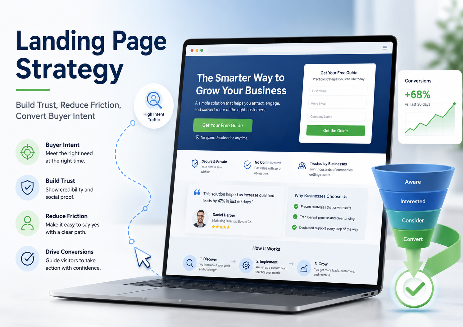
A strong landing page does not just look good. It helps the right visitor make a clearer decision. This guide explains how landing page strategy works by matching buyer intent, building trust, reducing friction, using proof well, and testing what helps more people take the next step.
Disclosure: If you click on my affiliate/advertiser’s links, I may receive a tiny commission. AND… Most of the time, you will receive an offer of some kind. It’ s a Win/Win!
What this article covers
In this article, I explain what landing page strategy really means, why buyer intent matters, how to build trust quickly, how to reduce friction, how to structure a high-converting landing page, and how to test and improve performance over time.
I will also show why a landing page is not just a design asset. It is a decision environment.
This article is based on practical business experience, independent research, and my own analysis and synthesis of how search behaviour, buyer intent, trust, friction, and decision-making affect real business outcomes.
Most landing pages do not fail because they look ugly.
They fail because they make the buyer work too hard.
The visitor clicks an advert, email, search result, LinkedIn post, or referral link because something caught their attention. They arrive with a reason. They may already have a problem, a need, a question, or a possible decision in mind.
Then the landing page either helps them move forward — or it breaks the momentum.
This happens more often than many businesses realise.
The page says too much.
Or not enough.
The headline does not match the advert.
The form asks for too many details.
The proof appears too late.
The button is vague.
The page looks nice, but the visitor still does not know what to do next.
A good landing page does not try to impress everyone.
It helps the right person make a clearer decision with less doubt.
In real business, a landing page is not just a design asset. It is a decision environment.
That is why landing page strategy matters.
It is not only about colours, buttons, or layout. It is about buyer intent, trust, clarity, proof, friction, timing, and one clear next step.
Over time, I’ve found that good decisions rarely come from data alone. They come from understanding people, reading signals, creating the right environment, and thinking beyond the immediate outcome.
That is true in strategy.
It is also true on a landing page.
Better decisions come from understanding behaviour, signals, environment, and consequences.
I write about how better decisions are made in business — combining strategy, behaviour, and practical thinking.
Key ideas
- A landing page should match buyer intent. The page must feel like the natural next step from the advert, search result, email, or link that brought the visitor there.
- Trust must appear early. Visitors quickly ask, “Is this believable, relevant, and safe?”
- Friction kills momentum. Long forms, unclear buttons, slow pages, and too many choices can stop even interested visitors.
- One page should usually have one main action. Too many options create hesitation.
- Testing should reveal where people hesitate. Do not test randomly. Test what helps the buyer decide.

What is landing page strategy?
Landing page strategy is the process of building a page around one clear visitor intent, one clear offer, and one clear next action. It brings together message match, trust, proof, page structure, user experience, and testing so the visitor can decide with less doubt.
A landing page is usually created for a specific purpose.
That purpose might be:
- booking a call
- requesting a quote
- downloading a guide
- joining a webinar
- buying a product
- signing up for a trial
- registering interest
- contacting the business
- comparing a service
- starting a free consultation
The best landing pages are not built around everything the business wants to say.

© captainvector, 123RF Free Images
They are built around what the visitor needs to understand before taking the next step.
That is a very different mindset.
A weak landing page says:
“Here is everything we want you to know about us.”
A stronger landing page says:
“You came here for this reason. Here is the answer, the proof, and the next step.”
Landing page strategy, in simple terms
Landing page strategy means building a page around one clear visitor intent, one clear offer, and one clear next step. The goal is to reduce doubt, build trust, remove friction, and help the right person take action.

How is a landing page different from a homepage?
A homepage usually serves many audiences.
It may need to help:
- first-time visitors
- existing customers
- job seekers
- partners
- suppliers
- journalists
- local users
- different customer types
- people at different stages of awareness
That is why homepages often have many links, sections, menus, and paths.
A landing page is different.
A landing page should normally focus on one campaign, one audience, one offer, or one action.
For example, if someone clicks an advert about “emergency boiler repair”, they should not land on a general homepage with ten different services.
They should land on a page that clearly says:
- emergency boiler repair is available
- who it is for
- how fast help can arrive
- what area is covered
- what proof supports the claim
- what to do next
That is message match.
And message match matters.
CXL explains that campaign traffic should not usually be sent to a homepage because homepages have too many possible actions and can distract from the goal of the campaign.
Why should a landing page focus on one action?
A landing page should usually focus on one main action because too many choices create hesitation.
This does not mean the page can only have one button.
It means the page should have one main goal.
For example:
- book a demo
- request a quote
- download the guide
- start a trial
- call now
- join the webinar
- get the checklist
If the page asks visitors to read five blog posts, watch three videos, follow you on social media, browse your services, sign up for a newsletter, and request a quote, the visitor may do none of them!
Choice can feel useful to the business.
But to the buyer, too much choice can feel like work!
A strong landing page makes the next step obvious.
Not aggressive.
Obvious.
What does buyer intent mean on a landing page?
Buyer intent on a landing page means the reason a visitor arrived and how close they are to taking action. A visitor who clicked a specific advert, searched for a service, or returned to a pricing page usually has stronger intent than someone casually browsing.
This is important because not every visitor arrives in the same state of mind.
Some visitors are just learning.
Some are comparing options.
Some are nearly ready to act.
Some are returning because they already saw the offer before.
Some are looking for reassurance.
Some are checking price, risk, proof, or timing.
A landing page should not treat all of them as if they know nothing.
If someone searches “best CRM software for small business pricing”, they are likely in a different place from someone searching “what is CRM?”
The first person may need comparison, proof, pricing clarity, and a low-risk next step.
The second person may need education.
That is why landing page strategy starts with intent.
What signals show someone is ready to act?
Buyer intent often appears through behaviour.
Common intent signals include:
- clicking a product advert
- searching for a specific service
- visiting a pricing page
- returning to the site more than once
- downloading a comparison guide
- clicking from a sales email
- searching for reviews
- searching for “near me”
- requesting a demo
- viewing case studies
- clicking a retargeting advert
- comparing two brands
- asking detailed questions
- reading FAQs before enquiring
These signals do not guarantee someone will buy.
But they show interest.
And interest should be respected.
A visitor with strong intent should not be forced through vague, generic copy.
They need clarity, proof, and a simple next step.
This connects closely to my work on customer intent marketing, where buying signals reveal when customers may be closer to making a decision.
How do you match the page to the promise that brought them in?
The page should feel like a natural continuation of the source that brought the visitor there.
This is often called message match.
If the advert promises:
“Free guide to reducing website form drop-off”
Then the landing page headline should not say:
“Welcome to our digital marketing agency.”
That breaks the promise.
A better headline would be:
“Download the Free Guide to Reducing Website Form Drop-Off”
The same idea applies to:
- Google Ads
- LinkedIn posts
- email campaigns
- referral links
- social media ads
- webinar promotions
- organic search results
- AI search citations
- partner campaigns
The visitor should feel:
“Yes, this is exactly what I clicked for.”
Directive Consulting identifies poor ad-to-page message match as a common landing page mistake because it causes visitors to bounce when the promise and the page do not line up.
Why does mismatch create doubt?
Mismatch creates doubt because it interrupts momentum.
The visitor expected one thing and got something else.
That creates questions:
- Am I in the right place?
- Did I click the wrong link?
- Is this offer really for me?
- Can I trust this business?
- Why does this page feel different from the advert?
Doubt is expensive on a landing page.
It does not always make people angry.
Often, it just makes them leave.
Buyer intent check
Before rewriting a landing page, ask this: what did the visitor already believe, want, search for, or click before they arrived here?
The page should feel like the natural next step from that signal.

How do you build trust before visitors scroll away?
You build trust quickly by making the page clear, specific, believable, and relevant. Strong landing pages use proof, plain language, customer examples, risk reducers, and credibility signals near the points where visitors are most likely to hesitate.
Trust has to appear early.
Visitors are often asking quiet questions before they click:
- Is this real?
- Is this for me?
- Do I believe the claim?
- Who else has used this?
- What happens if I click?
- Will I be pressured?
- Is this worth my time?
- Is my information safe?
- Can this business actually deliver?
If the page does not answer those questions, the visitor may leave even if the offer is good.
Use proof that feels real, not polished
Proof works best when it feels specific and believable.
Useful proof can include:
- testimonials
- named customer quotes
- review snippets
- case study results
- customer logos
- star ratings
- before-and-after examples
- short outcome statements
- media mentions
- industry accreditations
- screenshots of real feedback
But not all proof is equal.
A vague testimonial like:
“Great service!”
is better than nothing, but not very strong.
A stronger testimonial says:
“After using the service, we reduced missed appointments by 31% in three months.”
That gives the visitor something specific to believe.
Leadfeeder highlights credibility elements such as testimonials, case studies, and badges as part of strong landing page practice.
This also connects with testimonial marketing. Customer proof is not decoration. It helps reduce doubt.
Place trust signals near risk points
Trust signals should appear where the visitor may hesitate.
That might be:
- near the first call to action
- next to the form
- near pricing
- before payment
- before a quote request
- near a guarantee
- after a strong claim
- near a demo request
- before the final CTA
Examples include:
- “No credit card required”
- “Cancel anytime”
- “Trusted by 500+ UK businesses”
- “GDPR-compliant”
- “Secure checkout”
- “Rated 4.8/5 by customers”
- “Response within 1 working day”
- “Free consultation, no obligation”
The point is not to fill the page with badges.
The point is to support the decision at the moment doubt appears.
Write copy that sounds clear, human, and honest
Trust grows when copy sounds believable.
That means:
- use plain English
- avoid inflated claims
- say who the offer is for
- explain what happens next
- be specific
- avoid empty phrases
- avoid clever wording that hides the point
- do not promise what you cannot prove
For example, instead of saying:
“The ultimate revolutionary solution for business growth.”
Say:
“Get a clearer view of which landing page changes are most likely to improve enquiries.”
That is less flashy.
But it is easier to believe.
In my experience, clear usually beats clever.
Especially when someone is close to making a decision.
How do you reduce perceived risk for B2B buyers?
B2B visitors often need more reassurance because they may not be deciding only for themselves.
They may need to justify the decision to:
- a manager
- a finance team
- a technical team
- a board
- a client
- a procurement person
- another department
That means risk matters.
B2B landing pages often need to explain:
- what happens after the form
- how long the next step takes
- what information is required
- whether the offer is free
- whether there is any obligation
- whether the service is secure
- whether support is available
- whether the company has relevant experience
Directive Consulting points out that B2B landing pages often need to reduce risk because buyers may be accountable to several stakeholders.
This is why a landing page should not only persuade.
It should reassure.
How do you reduce landing page friction?
You reduce landing page friction by removing anything that slows visitors down, confuses them, distracts them, or makes the next step feel risky. Friction can come from long forms, slow load times, vague CTAs, too many choices, poor mobile layout, weak proof, or unclear page flow.
Friction is anything that makes the visitor think:
“This feels like too much effort.”
Sometimes friction is obvious.
A broken form.
A slow page.
A confusing layout.
Sometimes it is smaller.
A button that says “Submit” instead of “Get My Free Guide”.
A form asking for a phone number too early.
A headline that does not match the advert.
A mobile page where the button is hard to tap.
These small details can stop the visitor’s momentum.
Where landing page friction usually hides
Friction often hides in small details: a form that asks too much, a headline that does not match the ad, a button that feels vague, a slow mobile page, or a claim with no proof nearby.
Small doubts can create big drop-off.

Cut the number of choices on the page
A good landing page usually needs fewer choices, not more.
Common distractions include:
- full navigation menus
- unrelated blog links
- too many CTAs
- social media icons
- unnecessary pop-ups
- competing offers
- long sidebars
- unrelated case studies
- extra links that lead away from the goal
This does not mean every landing page must be bare.
But everything on the page should support the main action.
If it does not help the visitor decide, ask whether it belongs there.
Make forms short, simple, and easy to finish
Forms are a common source of friction.
A visitor may be interested until the form feels too demanding.
Ask only for what you truly need.
For example, if someone is downloading a free checklist, do you really need:
- job title
- company size
- phone number
- full address
- budget
- industry
- how they heard about you
Maybe not.
For a high-value B2B demo request, you may need more details. But even then, each field should earn its place.
Good form practice includes:
- clear labels
- single-column layout
- mobile-friendly fields
- autofill where possible
- inline error messages
- short helper text
- no unnecessary fields
- privacy reassurance
- clear button wording
Directive Consulting identifies overly complex forms as a common cause of landing page abandonment.
Remove small annoyances that create big drop-off
Small annoyances can quietly damage conversions.
Watch for:
- slow loading
- poor mobile layout
- tiny text
- poor contrast
- vague button labels
- cluttered sections
- hard-to-read paragraphs
- hidden pricing
- broken links
- unclear next steps
- auto-play videos
- intrusive pop-ups
- forms that reset after errors
The visitor may not complain.
They may simply leave.
That is why landing page optimisation is not only about one big idea.
It is often about removing many small sources of doubt and effort.
Make the next step feel safe
People are more likely to act when they understand what happens next.
Useful microcopy includes:
- “Takes 30 seconds”
- “No obligation”
- “No credit card required”
- “We’ll reply within one working day”
- “Your details are secure”
- “Free quote”
- “Download instantly”
- “Book a free call”
- “No spam”
These small details reduce uncertainty.
And uncertainty is often what stops action.

What structure should a high-converting landing page follow?
A high-converting landing page should guide visitors from intent to trust to action. A practical structure is: clear hero section, relevant benefits, proof, objection handling, simple CTA, short form, reassurance, FAQ, and repeated call to action after the visitor has enough confidence.
A landing page should feel like a smooth conversation.
It should not jump randomly from claim to form to image to testimonial to another unrelated offer.
The order matters.
A simple flow works best:
- Show the visitor they are in the right place.
- Explain the value.
- Prove the claim.
- Remove doubt.
- Make the action easy.
A simple landing page flow
- Intent match – show the visitor they are in the right place.
- Value – explain what they get and why it matters.
- Proof – show why they can believe you.
- Friction removal – make the next step easy and safe.
- Action – give one clear call to action.
Make the hero section do the heavy lifting
The hero section is the top part of the page.
It should quickly answer:
- what is this?
- who is it for?
- what do I get?
- why should I care?
- can I trust this?
- what should I do next?
A strong hero section usually includes:
- a clear headline
- a short supporting sentence
- one main CTA
- a relevant visual
- a proof cue
- a simple benefit
- no unnecessary clutter
For example, instead of:
“Marketing Solutions for the Future”
a better landing page headline might be:
“Get More Qualified Enquiries From Your Service Landing Pages”
The second version is clearer.
It tells the visitor what outcome the page is about.
CXL stresses that landing pages need to quickly answer whether the visitor is in the right place, whether the offer can be trusted, and what action is expected.
Use benefits to show outcomes, not just features
A feature tells people what something has.
A benefit tells people why it matters.
An outcome tells people what changes.
For example:
Feature: “Includes heatmap tracking.”
Benefit: “See where visitors stop scrolling or clicking.”
Outcome: “Find the sections that may be stopping people from enquiring.”
Landing pages should not only list features.
They should help the visitor imagine the useful result.
Useful benefit-led phrases might include:
- save time
- reduce wasted spend
- get clearer enquiries
- remove confusion
- improve trust
- simplify the next step
- avoid missed opportunities
- see what is working
- turn traffic into leads
- help customers decide faster
Handle objections before they become exits
Visitors often have objections before they act.
Common objections include:
- Is this too expensive?
- Will this take too long?
- Can I trust this business?
- Is this right for my situation?
- What happens after I click?
- Will I be pressured?
- Is my information safe?
- Will this actually work?
- Is there proof?
- What if I change my mind?
A strong landing page answers objections naturally.
This can be done through:
- FAQs
- testimonials
- guarantees
- short explanations
- security notes
- process steps
- case studies
- comparison tables
- “what happens next” sections
Do not make people guess.
Guessing creates friction.
Repeat the CTA after proof and objections
Some visitors are ready to act immediately.
Others need more information first.
That is why a landing page can repeat the same CTA at sensible points:
- in the hero section
- after the main benefits
- after proof
- after FAQs
- near the bottom of the page
Keep the wording consistent.
If the main CTA is “Get a Free Quote”, do not keep changing it to “Start Now”, “Learn More”, “Contact Us”, and “Submit”.
Different wording can create uncertainty.
Consistent wording makes the action feel familiar.

How do you use data to improve landing page performance?
You improve landing page performance by measuring where visitors arrive, where they hesitate, where they drop off, and which changes increase meaningful conversions. The goal is not random testing. The goal is to learn what helps the right visitors take action.
This is where landing page strategy connects to data analysis and analytics.
A landing page should not be treated as finished forever.
It should be measured, reviewed, tested, and improved.
But testing should have a purpose.
Do not change the button colour just because someone said it might help.
Ask:
“What problem are we trying to solve?”
Which landing page metrics should you watch?
Useful landing page metrics include:
- conversion rate
- bounce rate
- CTA click-through rate
- form start rate
- form completion rate
- scroll depth
- time on page
- traffic source
- device performance
- lead quality
- cost per lead
- sales-qualified leads
- drop-off points
Apexure recommends looking beyond conversion rate by also tracking form start rate, form completion rate, bounce rate, and engagement time.
For a B2B landing page, I would also watch lead quality.
More leads are not always better.
If the page brings in poor-fit enquiries, the conversion rate may look good while the sales team wastes time.
What should you A/B test first?
Good A/B tests answer one clear question.
You might test:
- headline
- CTA wording
- proof placement
- form length
- hero message
- guarantee wording
- page length
- pricing explanation
- trust signal placement
- mobile layout
- testimonial format
- image or video choice
Directive Consulting recommends testing headlines, CTAs, form design, and social proof placement as part of ongoing landing page optimisation.
Start where the doubt seems strongest.
If visitors arrive but do not click, test the hero message or CTA.
If people start the form but do not complete it, test form length or field clarity.
If people scroll but do not act, test proof placement or objection handling.
Why should tests answer one question at a time?
If you change too many things at once, you may not know what caused the result.
For example, imagine you change:
- the headline
- the CTA
- the form
- the image
- the testimonials
- the page length
Then conversions rise.
Good news.
But what caused the improvement?
You may not know.
Simple tests are easier to trust.
One clear question.
One clear change.
One clear result.
What does AI change in landing page optimisation?
AI can support landing page optimisation.
It can help:
- draft headline options
- suggest FAQ questions
- rewrite button copy
- summarise visitor feedback
- group customer objections
- generate page outlines
- create test ideas
- compare different page messages
- draft benefit-led copy
- turn long copy into simpler wording
That can be useful.
But AI cannot replace understanding buyer intent.
AI may create smooth copy that sounds good but does not match the visitor’s actual need.
It may produce a polished landing page that still fails because the offer, proof, and next step are unclear.
Use AI to support the work.
Do not let it replace the thinking!

What are the biggest landing page strategy mistakes?
The biggest landing page strategy mistakes are poor message match, too many CTAs, weak proof, unclear value, long forms, slow mobile pages, vague button copy, over-designed layouts, and testing changes without knowing what buyer doubt or friction you are trying to fix.
Most landing page mistakes come from forgetting the buyer’s point of view.
The business sees a campaign.
The visitor sees a decision.
Those are not the same thing.
Mistake 1: Making the page about the business instead of the buyer
Many landing pages start with the company.
“We are an award-winning provider of…”
That may be true.
But the visitor is usually thinking:
“Can this help me?”
A better landing page starts with the visitor’s problem, goal, or desired outcome.
Then it earns the right to explain the business.
Mistake 2: Asking for action before trust is built
Some pages ask for a call, demo, quote, or purchase before giving enough proof.
That can feel risky.
The visitor may think:
“Why should I trust you?”
A landing page should not wait until the bottom to build trust.
Proof should appear early enough to support action.
Mistake 3: Treating design as strategy
A beautiful landing page can still fail.
Good design helps.
But design is not strategy by itself!
Landing page strategy is about:
- buyer intent
- message match
- proof
- clarity
- friction
- page flow
- CTA
- testing
- decision behaviour
A page can look modern and still confuse people.
A page can look simple and still convert well if the thinking is clear.
Mistake 4: Measuring conversions without lead quality
This is especially important in B2B.
A landing page may generate more enquiries, but are they useful?
Track:
- lead quality
- sales-qualified leads
- booked calls
- proposal requests
- closed deals
- customer fit
- cost per real opportunity
- lifetime value
Directive Consulting recommends connecting landing page performance to pipeline metrics, not just surface conversions.
This matters because a high-converting landing page that attracts the wrong people may not be a good business page.
It may simply be good at creating noise.
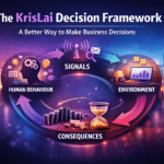
The KrisLai Landing Page Decision Lens™
- Behaviour – what is the visitor doing before, during, and after the page visit?
- Signals – what search term, click, scroll, form action, or hesitation shows intent?
- Environment – what source, device, context, offer, and pressure shape the decision?
- Consequences – what happens if the visitor trusts, hesitates, converts, or leaves?
A landing page works best when it helps the visitor make a clearer decision with less doubt.
Boost Online Conversions With Interactive Lead Funnels
involve.me enables you to not only understand and score your website visitors but offer them guided and tailored funnels, increasing both the likelihood of conversion and the quality of your leads. In addition, involve.me can be integrated directly into your martech and sales stack, enhancing the tools you already use and automating entire parts of your sales and marketing pipeline.
involve.me helps digital marketing professionals optimize conversion rates and generate high-quality leads through no-code interactive funnels without relying on developers or designers.
If you sign up via this link, you ‘ll get a 15% discount on involve.me purchases.
How does this connect to the KrisLai Decision Framework™?
This approach is part of the KrisLai Decision Framework™, a practical method for improving business decisions by looking at behaviour, signals, environment, and consequences.
A landing page may seem like a marketing page.
But it is also a decision point.
The visitor arrives with behaviour behind them:
- they searched
- clicked
- compared
- returned
- hesitated
- scrolled
- read
- ignored
- acted
- left
Those actions are signals.
The environment also matters:
- the device they use
- the source they came from
- the message they saw before clicking
- the level of urgency
- the trust they already have
- the risk they feel
- the clarity of the offer
- the proof on the page
Then come the consequences.
They convert.
They hesitate.
They leave.
They return later.
They trust you more.
They trust you less.
They tell someone else.
They decide you are not right for them.
This connects closely to how I think about decisions more broadly in the KrisLai Decision Framework™.
The same principle applies:
Better decisions come from understanding behaviour, signals, environment, and consequences.
Decision insight
A landing page is not only trying to get a click. It is shaping a decision. The clearer the message, the stronger the trust, and the lower the friction, the easier it becomes for the right visitor to take the next step.

Final thought: landing pages convert when they help people decide
Landing pages convert when they help people decide.
That is the simple truth.
Not when they are overloaded with clever copy.
Not when they try to impress everyone.
Not when they use every possible design trend.
A good landing page does a few important things well:
It matches the visitor’s intent.
It makes the offer clear.
It builds trust quickly.
It proves the claim.
It removes friction.
It explains what happens next.
It gives one clear action.
And then it is tested and improved over time.
Small changes can make a real difference.
A clearer headline.
A shorter form.
A stronger testimonial.
A better CTA.
A faster mobile page.
A proof point placed near the button.
A simple explanation of what happens after someone clicks.
These are not tiny details when they affect trust.
They are decision signals.
So do not start by asking how to make the landing page look better.
Start by asking:
“What does the buyer need to believe, understand, and feel safe enough to do next?”
That question will improve the page faster than decoration ever will!
Final takeaway
A strong landing page matches buyer intent, builds trust, reduces friction, and gives one clear next step. The best pages feel simple because the thinking behind them is clear.
Related reading on KrisLai.com
- Related article: Customer Intent Marketing
- Glossary or definition article: Data Analysis and Analytics
- Pillar topic: Business Thinking Hub
- Testimonial Marketing
- Curiosity Marketing and Selling
- Conceptual Selling
- Scarcity Selling Technique
- How AI Is Changing Search Behaviour
Further reading and references
Frequently Asked Questions About Landing Page Strategy
What is landing page strategy?
Landing page strategy means building a page around one clear visitor intent, one clear offer, and one clear next step. The goal is to build trust, reduce friction, and help the right visitor take action.
What makes a landing page convert?
A landing page is more likely to convert when it matches buyer intent, has a clear headline, gives one main call to action, shows believable proof, removes friction, and explains what happens next.
How does buyer intent affect landing page design?
Buyer intent affects landing page design because visitors arrive with different levels of interest and readiness. A high-intent visitor needs a page that quickly matches their search, advert, email, or referral and gives them a clear next step.
How do you reduce landing page friction?
You reduce landing page friction by removing anything that slows visitors down or creates doubt. This includes long forms, too many choices, unclear buttons, slow load times, poor mobile layout, weak proof, and confusing page flow.
What trust signals should a landing page include?
Useful landing page trust signals include testimonials, review snippets, customer logos, case study results, ratings, guarantees, security notes, accreditations, compliance details, and clear explanations of what happens after the visitor clicks.
How do you test a landing page?
You test a landing page by changing one important element at a time, such as the headline, call to action, form length, proof placement, or hero message. Each test should answer one clear question about what helps visitors act.
What is the biggest landing page mistake?
The biggest landing page mistake is making the visitor work too hard. This often happens when the page does not match the promise that brought them there, gives too many choices, lacks proof, or makes the next step unclear.

About the author
Kris Lai is a business operator and managing director with experience in land and building surveying, facilities management, logistics, and service delivery.
Earlier in his career, he worked as a Search Engine Evaluator (via Lionbridge, supporting Google), where he assessed search result relevance, user intent, and content quality using structured evaluation frameworks. This experience gives him a rare, practical understanding of how search systems interpret signals and make ranking decisions.
In parallel, whilst working with a charity organisation, he has delivered 1000’s of structured presentations in English, Finnish, and Chinese to audiences ranging from small groups to more than 600 people, and has spent decades mentoring and developing others. This experience informs his approach to clarity, communication, and decision-making under pressure.
He writes about AI, search behaviour, business strategy, and decision-making from a practical, real-world perspective.
If you enjoy exploring the ideas behind better business decisions, you may find the Business Thinking Hub useful.
👉 Explore ideas connected to better business decisions:
- How AI Is Changing Search Behaviour (And What Businesses Must Do Now)

- Decision-Making Framework Examples: The KrisLai Method in Action
- The KrisLai Decision Framework: A Better Way to Make Business Decisions
- Micro vs Macro Marketing: When to Target Broad Audiences vs Niche Customers
- Customer Intent Marketing: How to Turn Buying Signals Into Sales